Rec
I’ll click on an Ask that I’m interested in and then the colors will go from white background and black font to the brightest red background and white font. It legitimately makes my eyes hurt. If the color settings I set worked on every page, the website would be so much better!
Feb 7, 2024
Related Recs
Rec
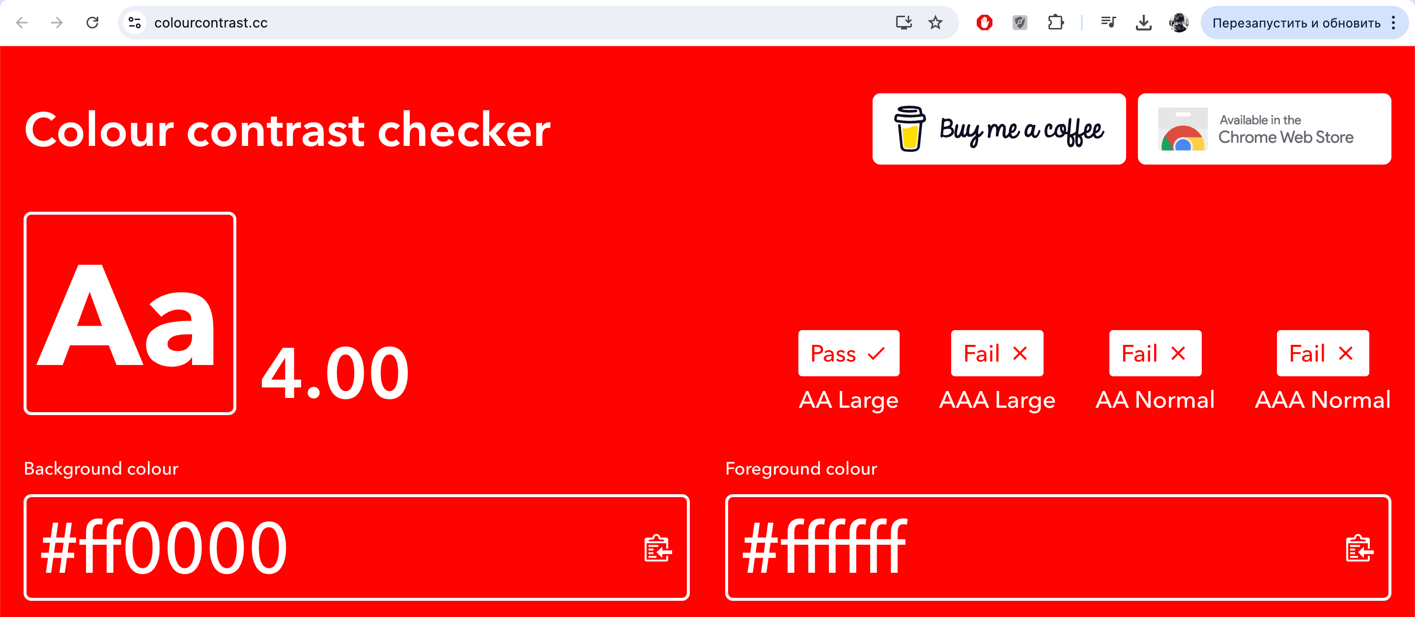
This red background color and the magenta one (#f211c1) don't pass accessibility check. It literally hurts my eyes to see such a bright colors and i can hardly read the small text in recs. Can you try some other color options? You can use this website to check if they would be suitable for web: https://colourcontrast.cc/
Rec
♿Someone mentioned being able to reduce the site's motion, and that's 100%—but I also think changing text font/size, overriding profile themes (basically making every single page on the site show in the theme you chose for your profile and the base site only), things like that. I need high contrast and some of the themes hurt my eyes.
Mar 11, 2025
Rec
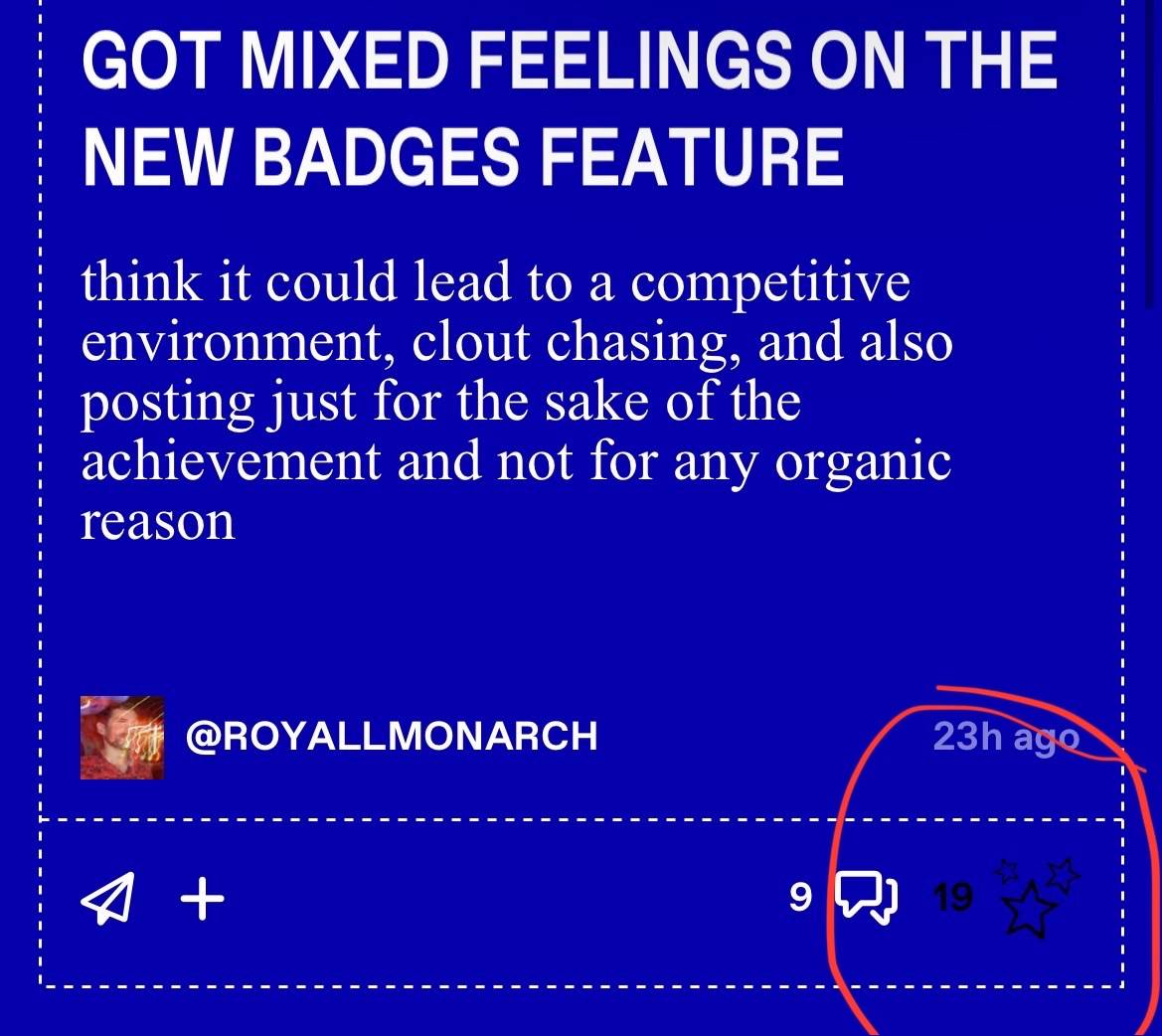
This may be more because i have my phone settings on the lowest brightness, but when going through replies to ask threads and trying to like them, i can barely see the likes star icon and numbers.
Also when i do like it, the icon and numbers disappears. If it was made like yellow or white to contrast on the blue color, that would be fantastic (which i think was how it was before)
Also when i do like it, the icon and numbers disappears. If it was made like yellow or white to contrast on the blue color, that would be fantastic (which i think was how it was before)
May 30, 2025