So that you can see what the post is about without having to click it. I think that would be more useful than the current hover text.
recommendation image
Feb 14, 2024

Comments (0)

Make an account to reply.
No comments yet

Related Recs

recommendation image
💻
it would probably also be preferable for me personally if you could see the link you added on hover instead of when you click it or maybe changing it to one click to view link and double click for redirect
Feb 29, 2024
i'm not a tech person whatsoever so dk the right term for this but when you hover over text that's too long to fit on the screen and it shows you what it says in a smaller font. i keep opening stuff i don't care to open bc idk what they're talking about yet 💔
Feb 24, 2025
ℹ️
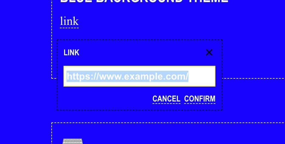
Currently, links are just a little icon up in the top. Maybe if they were more visible at the top or bottom they’d be more effective. Also, adding a small amount of preview for the link so that users know what they’re pressing. Something like the text used for re-recs.
Feb 14, 2024

Top Recs from @DAVEW

🦶
I don’t know where this comes from and it doesn’t really make sense but I will say it.
Feb 24, 2024
it's annoying packed & you're standing holding on to a pole but you're at peace
Feb 8, 2024