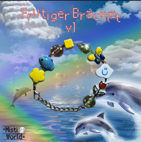
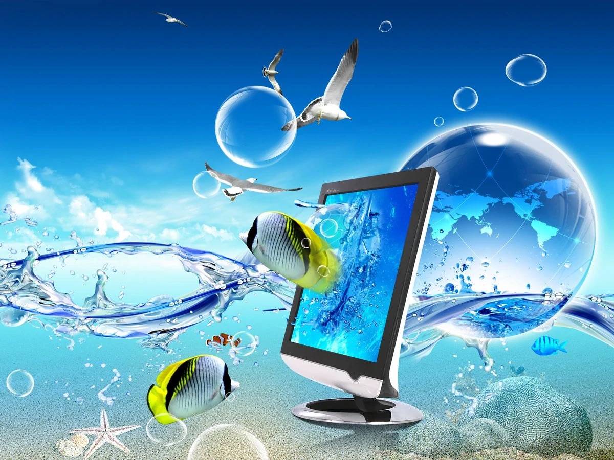
my friend told me the name for this a week ago and i felt so nostalgic. frutiger aero is the name of the font that was used in this time period and it’s an encapsulation of the early 2000’s/2010’s aesthetic, specifically early technology & big chunky microsoft computers & the typeface/ui that was commonly used back then (think desktop backgrounds~ lots of green/blue/white and naturalistic scenes).
**also made a spotify playlist of songs that give me this specific vibe it’s linked above!
i have several favorites. helvetica you will always be famous. garamond is my absolute favorite serif. i used to consider futura my favorite of all time but i kind of feel like i'm growing out of that (tbh a lot of that was probably due to vampire weekend). i like akzidenz-grotesk a lot. and verdana will always have a place in my heart (real ones know why lol)
I dwelled into this rabbit hole a while ago and stopped, but now I'm getting back up and focusing on it again because I will graduate soon and feel like I need to get serious about my life and who I want to become!