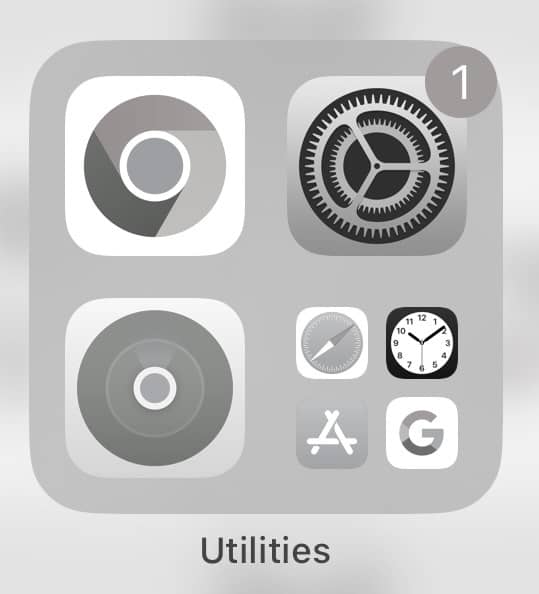
If you’re on an iPhone go to settings>accessibility>display and text size>color filters>on and tap on black and white. So much of it is lizard brain being engaged by bright colors so if it’s all black and white I find myself looking at it way less. Android also has a setting for it here https://birchtree.me/blog/how-to-set-your-iphone-or-android-phone-to-black-and-white-and-why-its-a-fun-experiement/
having your phone be black and white makes every app 10x less addictive. i turn my phone on & off black and white depending on what i’m doing and there’s an easy way to switch back and forth in settings by triple clicking the side button: accessibility > general > accessibility shortcut > color filters and then you can go to color filters (just search it) and choose grayscale. i set mine at ~90% intensity so i can still see a hint of color. i love looking up from my phone and thinking “wow, the world is so colorful”
Small thing that’s just helped me spend less time on my phone is switching everything to grayscale so it’s less fun to look at and it’s helped a lot. Makes my phone feel more like a tool and not an extension of my body. it’s somewhere in the accessibility menu on iPhone
ios > settings > accessibility > display & test size > colour filters > greyscale
then turn it off when u wanna look at photos/videos. makes them so much more special
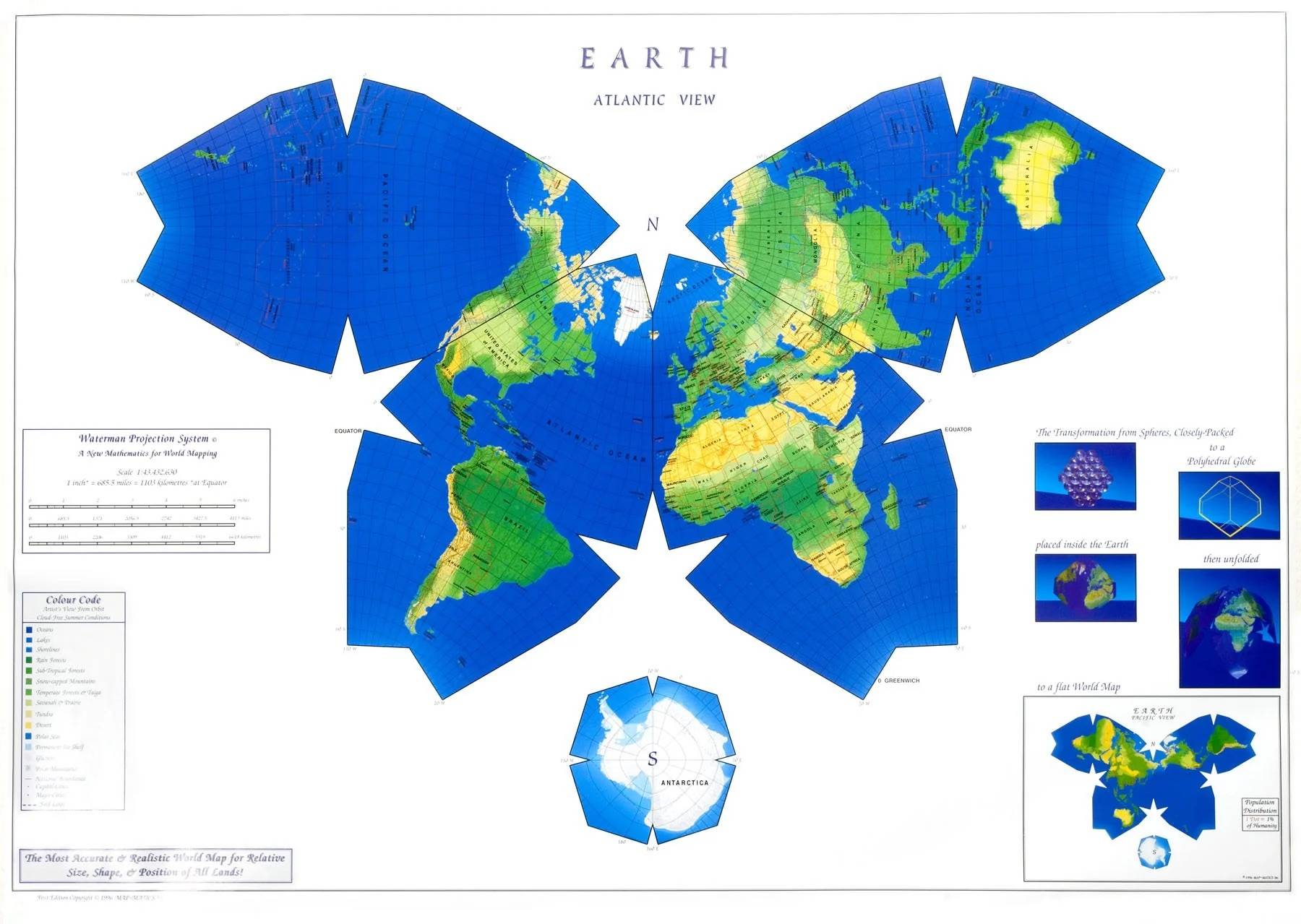
The best map projection for my money. Shows the continents (mostly) uninterrupted, doesn’t distort area or shape too badly, completely useless for navigation, looks beautiful. What’s your favorite map projection?