Rec
🗿
I was born in Australia, but grew up in Canada - and throughout my childhood and teens was often gifted for my birthday and holidays clothing from this Australian surfwear brand called Mambo. Unlike the popular skate brands of the time that’s primary function seemed to help teenagers to fit in (Stussy, Fuct, Alien Workshop Etc.) Mambo was truly fucking weird in its a commitment to an almost grotesque aesthetic; loud, cartoonish Hawaiian prints, thickly hand-painted graphics, and random slogans like “Spiritual Adventureware” and “Life Impregnates Art”; their most famous graphic is of a dog farting a musical note; there’s a photo of Robin Williams wearing their giant silk flame shirt during his Flubber era. Looking back, I still find it hard to believe that throughout the 90s a gigantic island of people who were enthusiastically wearing this esoteric stuff - but that hasn’t stopped me from late-night scrolling sessions on Grailed and adding items to my wishlist.
Dec 21, 2021
Related Recs
Rec
👗Maybe? Depends on your style. Aussie weirdo brand that I've bought some cool pieces for people before.
Jul 10, 2025
Rec
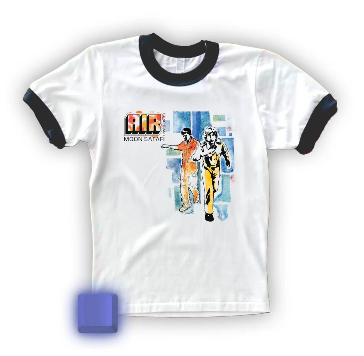
they can be found at @themodh on insta or fuckshein.com. lovely little shop & archive that sells limited recreations of zeitgest-y vintage tees originally spotted on pop culture darlings real and fictitious alike.
some noteworthy examples include the cat crewneck chloe sevigny wore in gummo, the i blame society tee from totally fucked up, and rentons bardot baby tee from trainspotting.
every piece is meticulously reverse engineered and the recreations are printed on 100% cotton blanks so you’re getting really great value for money!! i got this insane moon safari baby tee (as seen on clairo). wore it to see air last week and had so many people stop me and ask where it was from it has quickly become my favourite piece in my wardrobe <3
Jun 13, 2025
Rec
⭐baggy skate clothing from australia, and lasts a long old time. Expensive but clean, tidy and always looks good
Feb 26, 2025
Top Recs from @asher-penn
Rec
🤡RIP to this absolute GOAT of a sobriety meme account. I think I stopped drinking around the time that sobriety memes were in their second wave - 12-step inside jokes that were ideally harrowing, embarrassing, and hopeful in their shared hopelessness - and while Brutal Recovery, Fucking Sober, and Dumbsoberbitch are great, no account could perform these lacerations with the expertise of a surgeon as @facebooksober. Like an elephant balancing itself on a dime, facebook sober managed to capture the divine paradox’s inherent to recovery with such aesthetic grace and poetry I was 100% convinced that the person behind the account was a hot girl (it was a dude, lol). Whatever. Hot Newcomers Are Forever.
Dec 21, 2021
Rec
🌚On a recent trip to Paris a friend invited me to an after-party at a place called Silencio aka “David Lynch’s Nightclub.” I got there early, and descending the 6 flights of black carpeted stairs that’s only signage read “no phone use or photographs” became increasingly aware I was entering something special - the carpeting continued into what felt like a sound-proofed underground bunker where every detail - the lighting to the furniture, to the bar, the bathrooms mirrors - was considered which such deep precision that I felt transported into Lynch’s vision in a way that none of his films, writing or music ever has. I stood at the bar drinking an uncannily delicious coca-cola from the bottle in dumbfounded awe. This was not a movie set... it was the real thing. I later read that Lynch’s goal was to "induce and sustain a specific state of alertness and openness to the unknown.” Mission accomplished. I can say with conviction that no interior space that was designed with intention has ever made me *feel* the way Silencio does.
Dec 21, 2021
Rec
🍌They say that the best design is no design, and I can’t think of a better example than No Frills, a low-cost supermarket chain in Canada that since the late ’70s has been easily recognized for its iconic simple in-house branding. Operating on the premise that making graphic design decisions is a major unnecessary expense No Frills follows a strict style guide of Pantone Yellow C combined with large bold Helvetica Neue 75 for all its interiors and packaging: pickles, dark chocolate, hummus, evaporated milk, olive oil all get the same point-blank treatment. The closest I’ve ever seen to this aesthetic is on that TV show Lost where all the food comes from The Dharma Initiative. Walking down their aisles can feel dystopian and autistic but also timelessly chic - a ridiculous marketing concept leaned into with a commitment that I hope they never abandon.
Dec 21, 2021